1) Meet the Mercury Mets
Mets man of the hour Matt Harvey is an extraordinary pitching talent, a fierce competitor, punctual, and just an all-around great guy. But did you know that the amazin’ ace is also something of a fashionista? True story.
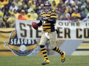
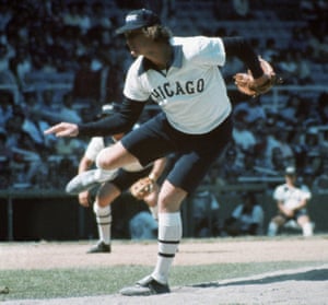
“Some fun brands I like right now are Rag and Bone, ATM, Zegna, Tommy Hilfiger and, of course, my go-to, John Varvatos,” Harvey told nycgo.com back in April, right around the time Mets brass either set or didn’t set a pitching limit with his super-agent Scott Boras. Considering the amount of fuss that came from throwing a few extra post-Tommy John surgery innings, can you even begin to imagine what kind of distress calls Harvey would have made to his agent had he actually been forced to appear on the mound as a Mercury Met? Orel Hershiser on the other hand, a bulldog of a pitcher cut from an entirely different cloth, did what he had to do without complaint, donning this unique, futuristic jersey for one night only back on 27 July 1999.
How else can you describe something that, if nothing else, was completely out of this world? The only solace Mets fans can take in this all-but-forgotten moment in their history, is that they were not alone. No fewer than 21 teams had prints designed during a stunning piece of corporate symmetry that helped sell the real estate firm of Century 21 during an unprecedented promotion dubbed “turn ahead the clock” night, which is of course, the reverse of turn back the clock nights featuring throwback jerseys of yesteryear. The promotion actually extended all the way onto stadium scoreboards: Tomorrowland-ish graphics featuring updated position names such as “left-sector” (left field) and “intermediate station” (shortstop) put a shiny bow on the festivities. For whatever reason, the turn ahead the clock promotion failed to catch on enough to warrant a second date.
2) At loggerheads with leatherheads
Throwback uniforms are supposed to celebrate the good old days, and the 1930s were not that for the NFL. The league was in its infancy, dominated by the college game, and featured a style, speed and strategy that’s unrecognizable when compared with the game of today. Yet the Pittsburgh Steelers and Green Bay Packers a duo which, by the way, have a pair of classic looks that rank towards the very top of the NFL jersey standings, have insisted on wearing these leatherhead-era uniforms every now and then. Now, I’d buy in happily if they rolled out wearing old-school soft helmets, but that’s not going to happen. So, having said that, I’d limit NFL throwbacks to 1960s AFL classics such as the San Diego Chargers powder-blue bolt look, which should obviously be adopted full-time, and the Bills “OJ” uniforms, featuring a kinder, gentler, simpler red buffalo.
As for the Pittsburgh throwback, well, it is even worse than the team which originally wore it: the 1934 Steelers went 2-10. That the franchise would occasionally wear uniforms donned some 35 years before the team made its first legitimate impact on the sport makes no sense … never mind that it puts at least 20 extra pounds on their already robust quarterback Ben Roethlisberger.
3) Workin’ on our knight moves
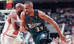
Once upon a time, teal was more or less the exclusive property of the Miami Dolphins. Then came the San Jose Sharks who took on a varying shade of aqua, and before long, the copycats were off and running a race to the very bottom. When it comes to uniforms, one of the more unforgivable sins is changing your color scheme. Only a few teams have gotten away with it over the years, including two listed below. Needless to say, the Detroit Pistons were not not one of those teams.
The years between 1996 and 2001 were known to Pistons as the “teal era”, but perhaps even worse than the color scheme, was the logo. Somehow a chess piece made its way on to their tank tops in the form of a fire-breathing knight, one that made Grant Hill look just foolish, not to mention what it did to Joe Dumars. The Pistons guard won two titles during the teams glory years while wearing their classic red white and blue look, which, truth be told, did include rather circumspect lacrosse style shorts. Imagine the indignity he suffered as his distinguished career closed out while wearing a look that was eventually abandoned for something more in line with franchise traditions.
4) The Ducks don a dud while the Great One wears a whopper
Can I be frank? I do not like the Anaheim Ducks, at all. Their existence is revolting. That a real, live, NHL team was born out of a film, The Mighty Ducks, offends each and every one of the senses. The Charlestown Chiefs joining the circuit? Well, that would be another story altogether … but I digress.
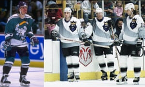
Today the Ducks have one of the more nauseating color schemes in the NHL: orange, black and gold, to go along with a “D” that is devoid of any reasonable design standard. That’s a tradition born out of tradition of course, and that tradition is nasty uniforms. The Mighty Ducks of Anaheim have always looked ridiculous, once featuring a color described as “eggplant” in addition to a host of other vile missteps. The granddaddy of them all came when they introduced an alternate jersey featuring an enormous cartoon duck. A cartoon duck.
Even more incredible is that the sweater was introduced during a date with their So-Cal rivals, who at the very same time were also wreaking havoc with design.
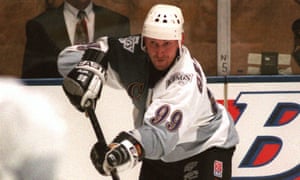
The Los Angeles Kings are one of those teams that survived an overhaul of their color scheme, abandoning the purple and gold, LA Lakers look (they were both owned by Jack Kent Cooke when the Kings came to the NHL in 1967) for a somewhat clichéd but more robust Raiders layout in 1988. Then, in 1996 came an alternate jersey, just in time for a meeting with the Ducks.
It included several rash changes including thick gradient stripes. The humdinger was, of course, the human-ish image on the front corner which looked a whole lot like a certain burger chain king. The face, and total package, is in fact so impossibly bad, that it’s almost good. That Wayne Gretzky was forced to lace up his skates in a shirt as hideous as this is as close to hockey heresy as you can get (that or Maurice Ricard in the Ducks alternate).
5) Look at me, I can be, (short) center field
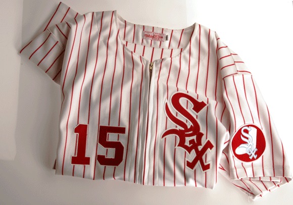
Uniforms are a big part of franchise identity: the Detroit Tigers’ Old English “D”, the Yankees’ interlocking NY and pinstripes, the Cardinals redbirds on the bat, and so on. Those teams have been around a long time, and so have the White Sox, except over the years, the Pale Hose never seemed to hold on to any jersey style for very long. Black, red, powder blue, navy blue, yellow accents, different logos, different fonts, different everything: that they’ve been wearing more or less the same uniform for roughly 25 years constitutes a minor miracle.
Which look stands out the most over their 112-year history? Well, that would have to be the pullover “pajama style” tops, with shorts (that’s right, shorts), worn for just a few games in August of 1976. Dan Epstein of Rolling Stone Magazine described them best: “…collared V-neck pullovers that looked like a cross between 1870s baseball tunic and a 1970s leisure suit.” Epstein also described them as “dressing like a beer-league softball team,” another spot on observation.
Bill Veeck bought the team a year earlier, and was quick to show his sense of humor, in addition to that famous, trademark penchant for marketing. The shorts also had a practical function: for anybody who ever felt sorry for players having to wear pants in the summer, especially in the AstroTurf era, when television cameras routinely picked up waves of heat rising off the plastic, shorts were a refreshing look, even if the Chisox must have picked up a fair share of raspberries.
In August of this year manager Robin Ventura and his Chisox wore the tops as a tribute to this one-year-wonder, but in a move just as shameful as the initial creation of these once-in-a-generation “designs”, they didn’t wear the shorts, and shame on them.
6) No, no, no…
In Roman Mars’ Ted Talk, “Why city flags may be the worst-designed thing you’ve never noticed,” he lays out some basic parameters for flags. Five principles are discussed:
- Keep it simple.
- Use meaningful symbolism.
- Use two to three colors
- No lettering or seals. Never use writing of any kind.
- Be distinctive.
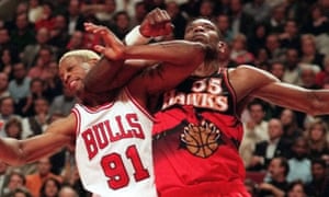
Let’s apply that logic to the the 1995-1999 Atlanta Hawks jerseys and see how we do.
First off, since uniforms generally require lettering or seals in order to be uniforms, let’s throw out that parameter. Now, the Hawks jerseys use two to three colors, and are, well, reasonably distinctive. However, there is nothing simple about an enormous print on a basketball uniform, which generally speaking, has less surface area to work with than other sports jerseys because there are no sleeves (except on Christmas).
The uniform is also devoid of any sort of meaningful symbolism, unless you take inspiration from a killer hawk holding a basketball. Oh, and it’s also plain ugly. Surely players, at the very least, have the ear of owners in these sort of decisions. If so, Dikembe Mutombo, who was renowned for his rejections, whiffed on this one.


